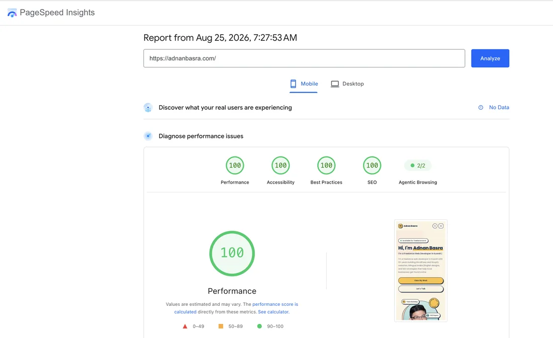
My website, adnanbasra.com, scores 100 for Performance, Accessibility, Best Practices and SEO — on mobile and on desktop. I'm going to use that as a worked example, because the interesting part isn't the four green circles. It's everything the PageSpeed report says about them.
Plenty of agencies will screenshot a score like this and imply it's why a site ranks. That's not how it works, and pretending otherwise sets clients up to be disappointed. Here's the honest version.
PageSpeed Insights measures two completely different things
This is the distinction almost everyone misses, and once you see it the whole report reads differently.
Lab data is a simulation. Google loads your page once, on a virtual mid-range phone, on throttled 4G, in a data centre. It's repeatable and diagnostic — perfect for finding problems. It is not a measurement of your actual visitors.
Field data is real. It comes from the Chrome User Experience Report — anonymised measurements from real Chrome users who actually visited your site over the previous 28 days. That's the section at the top labelled "Discover what your real users are experiencing."
Only one of those two is a Google ranking signal, and it isn't the one with the big score on it.
Why my report says "No Data" — and why that's the honest headline
Look at the top of that screenshot. Field data: No Data. That means my site doesn't yet have enough real Chrome visitors for Google to build a statistically meaningful sample.
So the 100 is a lab result on a site with no field data. It tells me the page is built well. It tells me nothing about what real users in Kuwait experience on their actual phones and connections — and it contributes nothing to Core Web Vitals as a ranking signal, because there's no field dataset to contribute.
If you take one thing from this post: a perfect lab score on a site with no field data is a good engineering result, not an SEO result. Any agency showing you a 100 without mentioning which of the two they're showing is either confused or hoping you are.
So does page speed actually affect Google rankings?
Yes, but less dramatically than the industry implies. Core Web Vitals — measured from field data — are a genuine, confirmed part of Google's page experience signals. They are also a relatively lightweight one.
The realistic model is this: speed rarely wins you a ranking you didn't otherwise deserve, but slowness can cost you one you did. Between two pages of comparable relevance and authority, the faster experience has an edge. Against a far more relevant page, being fast doesn't save you.
The larger commercial effect isn't ranking at all — it's conversion. People abandon slow pages before they ever become a customer. That happens whether or not Google notices, which is why I'd argue for speed even if it carried no ranking weight.
The three Core Web Vitals, in plain terms
Three metrics carry the ranking weight. Everything else in the report is diagnosis.
- LCP — Largest Contentful Paint. How long until the biggest thing on screen appears. Usually your hero image or headline. Good is under 2.5 seconds.
- CLS — Cumulative Layout Shift. How much the page jumps around while loading. The reason you tap the wrong button because an advert loaded late. Good is under 0.1.
- INP — Interaction to Next Paint. How quickly the page responds when you tap something. Good is under 200 milliseconds. This one only exists in field data — the lab substitute is Total Blocking Time.
Why the mobile and desktop numbers look so different
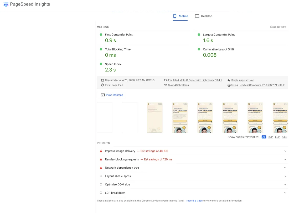
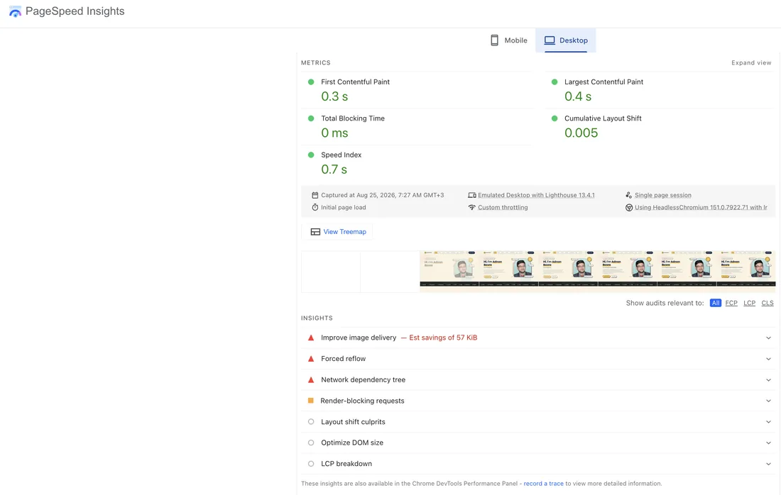
Both reports score 100, but the underlying numbers aren't close:
| Metric | Mobile | Desktop | "Good" threshold |
|---|---|---|---|
| Largest Contentful Paint | 1.6 s | 0.4 s | under 2.5 s |
| Cumulative Layout Shift | 0.008 | 0.005 | under 0.1 |
| First Contentful Paint | 0.9 s | 0.3 s | under 1.8 s |
| Total Blocking Time | 0 ms | 0 ms | under 200 ms |
| Speed Index | 2.3 s | 0.7 s | under 3.4 s |
Mobile LCP is four times slower than desktop on the identical page. That's not a mobile bug — it's the test. Google throttles the mobile run to a mid-range Android on a slow connection, on purpose, because that's closer to a realistic worst case than the machine you built the site on.
Always judge by mobile. Google indexes mobile-first, most Kuwait traffic is mobile, and the mobile number is the one closer to what a customer on 4G in a car park actually gets.
A 100 does not mean there's nothing left to fix
This surprises people. Scroll below the perfect score on my own report and Lighthouse still lists work:
- Improve image delivery — an estimated 46 KiB on mobile, 57 KiB on desktop
- Render-blocking requests — an estimated 120 ms on mobile
- Network dependency tree, forced reflow (desktop), DOM size and LCP breakdown
The performance score is a weighted composite of five metrics, rounded. Once each metric sits comfortably in its "good" band, further gains stop moving the number — but they're still real milliseconds for real people. The score saturates long before the page stops being improvable.
Which is the answer to "we're already at 100, why would we optimise further?" Because 100 is the top of the scale, not the end of the work.
The SEO score is not an SEO audit
This is the most over-sold number in the entire report. Lighthouse's SEO category checks roughly ten mechanical things: does the page have a title, a meta description, crawlable links, alt attributes, a valid robots.txt, a successful status code, and so on.
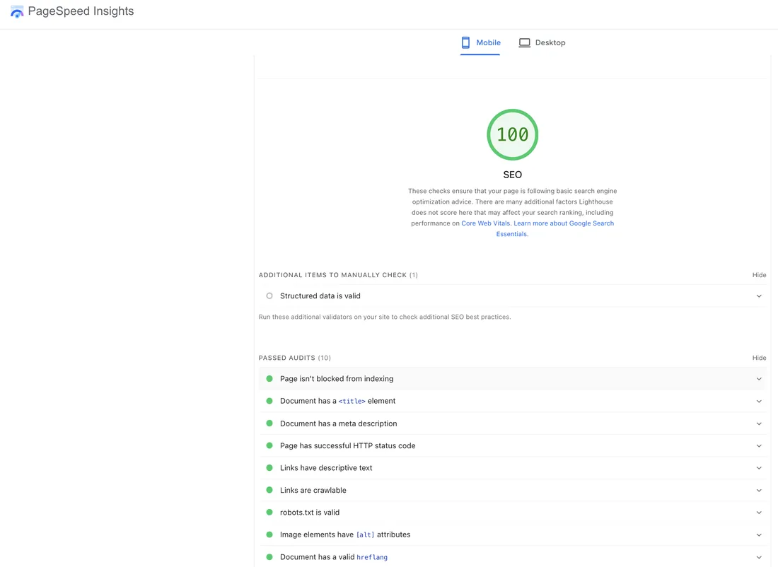
An SEO 100 means your page is technically eligible to be indexed and understood. It says nothing about whether you targeted the right keyword, whether your content answers the question better than the competitor, or whether anyone links to you. Those decide rankings. This score is a pre-flight check, not a strategy — the difference I wrote about in why design and SEO should never be separate.
The new category: Agentic Browsing
Recent Lighthouse versions added something worth watching. Alongside the familiar four, there's now an Agentic Browsing check — Google's own description is that it ensures sites are high-quality and browsable for AI agents.
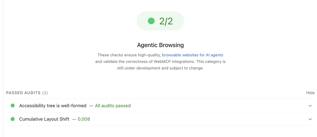
Look at what it actually tests — a clean accessibility tree and a stable layout. Both are things good developers already did for humans. An AI agent parsing your page has roughly the same needs as a screen reader: clear semantic structure, and content that doesn't move while it's being read.
Google flags this category as still under development, so don't rebuild anything around it. But the direction is clear enough, and it lines up with everything I've written about getting cited by AI search: the technical groundwork for ranking, for accessibility, and for being readable by machines is largely the same groundwork.
What actually moves these numbers
Ranked by how much return I typically see per hour spent:
- Images. Almost always the biggest win. Serve WebP, size them for their display size, set explicit
widthandheight, lazy-load anything below the fold. The five screenshots in this post are WebP and total about 114 KB — as PNGs they were over 1.5 MB. - Explicit dimensions on everything. Images, embeds, ad slots. This is the single most effective fix for layout shift, and it's nearly free.
- Fonts. Self-host, preload the weights you use above the fold, and set
font-display: swap. Third-party font CDNs cost you a DNS lookup and a connection before a single letter renders. - Ruthless JavaScript. Every analytics tag, chat widget and tracking pixel is someone else's code running on your critical path. Audit what's actually earning its place.
- Hosting and caching. Cheap shared hosting with a slow server response caps everything downstream. No amount of front-end work fixes a slow first byte.
Why this matters more in Kuwait than the score suggests
Two local realities make speed a commercial issue rather than a technical vanity metric.
First, traffic is overwhelmingly mobile and often on cellular rather than wifi. The throttled mobile test isn't paranoia here — it's closer to a Thursday evening on a busy network than the desktop number will ever be.
Second, bilingual sites carry more weight by default. A site serving Arabic and English can end up loading two font families and duplicate assets. Done carelessly, the Arabic version is measurably slower than the English one — and nobody checks, because the agency tested in English.
If you run a bilingual site, run PageSpeed against both language versions. I've yet to see a case where they scored the same.
How to read your own report in five minutes
- Test the mobile tab, not desktop.
- Look at the field data section first. If it says No Data, everything below is a simulation — useful, but not a ranking signal.
- Check LCP and CLS against the thresholds above. Ignore the composite score for a moment.
- Open the Insights list and read the estimated savings. That's your actual to-do list, ordered.
- Run it again on your slowest, heaviest page — usually a product or gallery page, never the homepage you've already tuned.
That last step catches more real problems than anything else. Homepages get optimised because they get tested; the pages that lose you customers are the ones nobody ever ran through the tool.
The bottom line
A perfect PageSpeed score is worth having. It means the fundamentals are right, and it removes speed as an excuse. But it is a diagnostic, not a ranking. Content relevance, search intent and authority decide where you rank; speed decides whether the visitor sticks around long enough to matter.
The report on this page is a lab result with no field data behind it. That's an honest thing to say about my own site, and it's the same honesty I'd want from anyone showing you a screenshot of green circles.
If you want to know what your own site actually scores — and more usefully, which two or three fixes would move it — send me the URL. I build and tune sites for Kuwait businesses as part of my web development and SEO work.
Related reading
- Why website design and SEO should never be separate
- Bilingual Arabic/English SEO in Kuwait
- How much does a website cost in Kuwait?
Related services

Written by Adnan Basra
Senior Web Developer & E-Commerce Manager based in Kuwait, with 13+ years building websites and driving organic growth for businesses. Get in touch →
Want to know what your site really scores?
Send me your URL and I'll tell you which fixes are worth doing — and which are busywork.